I came across something interesting in a tablet app today and I thought it was a great example of bad design. I hate to go critical, especially for a service I love, and especially since I'm no expert in tablet design myself, but I thought it would be a good illustration and a good discussion here.
Late last year I discovered TripIt. Apparently everyone at Adobe uses it and I was just late to the party. It is - essentially - a way to track flights and trip information. It's real handy when you are traveling and need a quick way to look up your flights and hotel information. I used to simply copy and paste this information into an Evernote note called "Travel", and if I forgot to do so, I was screwed. Tripit makes this nicer though - especially since you can actually forward them emails from your travel agent. Anyway - go to the site - check it out - love it - etc.
I've had the mobile version for some time now, but just today I decided to check out their iPad2 version. I was pretty surprised by how badly they made use of the tablet form. After selecting a trip, this is what you see:
That's a heck of a lot of white space. I thought maybe I had hit the wrong button, but as far as I can see, that's the main view. To actually see your itinerary, you click the itinerary button to make it fly out:
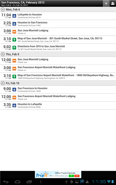
I find it really odd that the default view makes so little use of the space. Maybe there is other data that shows up there, but wouldn't the itinerary normally be the most critical information? Compare this to their Android version:

I thought that was the end of it until I accidentally oriented my iPad into Landscape mode and saw this:
Now that makes sense to me. So any ideas why the Portrait mode is so bare? As I said, maybe there is trip information folks store that normally show up there. I only use TripIt in a pretty basic manner so I may be missing something.
Archived Comments
Apparently you haven't used the email app on the iPad either. It's the same interface. I guess they're just following an annoying standard that has already been established.
That's actually a common theme for frames in iOS apps. If you look at twitter, facebook, heck even the built in email client the frame doesn't show up unless you click the button in the top left and then when you flip it landscape view it looks fine. I usually use my iPad in landscape anyways.
I'd check to see which mobile device is accessing my pages and switch accordingly to compose the view. I use dynamic CSS (<div></div> tags) to allow for expansion on the white space so it auto stretches the blank space as needed (as in this case where the space is pre-configured to the length of the largest drop down). Not hard to do in CSS for mobile, but not easy either. On most it works on some it does not.
My guess is that they also messed up on the DTD for I-Pads. While most mobile devices use the DTD for mobile sites, I also include the basic web DTD as well for I-Pad. This seems to help on my mobile developed sites.
I am guessing that this was designed for mobiles first, and nothing was changed for it to run on the tablet.
Totally Andrew.
I still remember the days when I had to build two websites for one product. One for IE and one for Netscape! Both in seperate folders
Ah! Thise were the days.
no comment, except what a pain those days where.
That is why we bill by the hour. :-)
The simplest possible way to make an iPhone app "work" on an iPad is to add your existing list screen and detail screen to a standard split view controller. (That's portrait/menu, landscape/side-by-side view shown in your example.)
Boom. A couple of hours work, and you're now iPad compatible.
Either they're working on an iPad-specific app, and this is just a placeholder until it's done... or they're incredibly lazy.
Also there are plenty of cyber aids out there to test mobile apps. Why not use one of those?
My favourite is http://www.mobilephoneemula... by Pixmobi
You set the size of your screen and run the mobile site on it.
You can change the settings and use different browsers to test as well.
This is the standard for the SplitViewNavigator in Flex Mobile
http://devgirl.org/2011/12/...
It certainly makes development quicker. I've used the same method on one app I wrote. I managed it manually for the 2nd app I wrote, but this (as others have said) does seem pretty standard.
Gareth - I have no issue with the UI per se - but in this case, they didn't use it correctly. The itinerary could have been put on the main view, and some other content in the pop up.
I didn't know if it was a Flex Mobile app styled in the Apple Theme though. If so, the setup of what shows there is somewhat set (unless you manually alter it). I agree that perhaps they could've chosen better content, but the default is adding the method calls and attributes of "showFirstViewNavigatorInPopUp" and "autoHideFirstViewNavigator" Definitely a very lazy way to switch from portait to landscape and have all of your navigation handled for you, but perhaps they went the quick 'n' easy way :)