A. Stanley asks:
I am using cf9 report builder to generate a PDF of a pie chart with many slices (i.e. 14) . When I select 'data label: pattern', for my pie chart, the labels overlap. I have tried changing the size and style (e.g. sliced instead of solid) to no avail. The labels on the pie chart still overlap. I have increased the width and height as much as possible, but the chart is displayed with a page header and footer, so I am unable to use the entire width/height of the page. Is there at least a way to modify the legend so that I might add the [data label: pattern] (e.g. itemName n x% of y) information there and remove the labels from the pie chart altogether?
Unfortunately the last time I used ColdFusion's Report Builder I was a lot less gray and I think HomeSite+ was the best ColdFusion editor. Luckily though I was able to reproduce her issue with a vanilla cfchart and move from there. She sent me fruit data (why not beer???) that I turned into a query like so.
<cfset q = queryNew("fruit,total","cf_sql_varchar,cf_sql_integer")>
<cfset queryAddRow(q)>
<cfset querySetCell(q, "fruit","apples")>
<cfset querySetCell(q, "total",112)>
<cfset queryAddRow(q)>
<cfset querySetCell(q, "fruit","oranges")>
<cfset querySetCell(q, "total",304)>
<cfset queryAddRow(q)>
<cfset querySetCell(q, "fruit","bananas")>
<cfset querySetCell(q, "total",0)>
<cfset queryAddRow(q)>
<cfset querySetCell(q, "fruit","pears")>
<cfset querySetCell(q, "total",0)>
<cfset queryAddRow(q)>
<cfset querySetCell(q, "fruit","grapes")>
<cfset querySetCell(q, "total",16)>
<cfset queryAddRow(q)>
<cfset querySetCell(q, "fruit","strawberries")>
<cfset querySetCell(q, "total",80)>
<cfset queryAddRow(q)>
<cfset querySetCell(q, "fruit","plums")>
<cfset querySetCell(q, "total",48)>
<cfset queryAddRow(q)>
<cfset querySetCell(q, "fruit","pineapples")>
<cfset querySetCell(q, "total",32)>
<cfset queryAddRow(q)>
<cfset querySetCell(q, "fruit","blueberries")>
<cfset querySetCell(q, "total",16)>
<cfset queryAddRow(q)>
<cfset querySetCell(q, "fruit","raspberries")>
<cfset querySetCell(q, "total",32)>
<cfset queryAddRow(q)>
<cfset querySetCell(q, "fruit","apricots")>
<cfset querySetCell(q, "total",256)>
<cfset queryAddRow(q)>
<cfset querySetCell(q, "fruit","tangerines")>
<cfset querySetCell(q, "total",705)>
<cfset queryAddRow(q)>
<cfset querySetCell(q, "fruit","cherries")>
<cfset querySetCell(q, "total",1)>
<cfset queryAddRow(q)>
<cfset querySetCell(q, "fruit","peaches")>
<cfset querySetCell(q, "total",0)>
Obviously this would normally be a database query and be a heck of a lot smaller. I then passed this into a pie chart.
<cfchart chartheight="500" chartwidth="500">
<cfchartseries type="pie" query="q" itemcolumn="fruit" valuecolumn="total" datalabelstyle="pattern" >
</cfchart>
And we can see right away the - um - "suboptimal" rendering:
Gross. So I did what I normally do in cases like this and opened up the chart editor. I entered additional data and recreate the issue in their tool. I then played around and discovered that the Data Labels editor has an option called AutoControl. If you mouse over this you see: "Toggles auto control of overlapping labels"
Yeah - no way it's that easy. I turned it on and bam - it worked. So I snagged the XML (and tweaked a few more small things) and got this:
<?xml version="1.0" encoding="UTF-8"?>
<pieChart depth="Double" style="Solid" is3d="false">
<dataLabels style="Pattern" autoControl="true"/>
<paint palette="PastelTransluent" paint="Plain" min="44" max="95"/>
</pieChart>
The critical part is autoControl="true". Here is the complete code then to use this XML:
<cfchart chartheight="500" chartwidth="500" style="#cxml#">
<cfchartseries type="pie" query="q" itemcolumn="fruit" valuecolumn="total" datalabelstyle="pattern" >
</cfchart>
<cfsavecontent variable="cxml">
<?xml version="1.0" encoding="UTF-8"?>
<pieChart depth="Double" style="Solid" is3d="false">
<dataLabels style="Pattern" autoControl="true"/>
<paint palette="PastelTransluent" paint="Plain" min="44" max="95"/>
</pieChart>
</cfsavecontent>
And the result is:
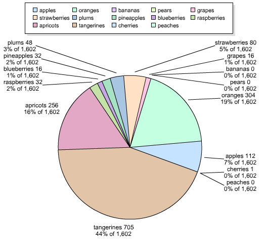
Still "busy" but a heck of a lot more readable. (I'd probably reduce the smallest 5 items into one bucket, but thats for another blog post.) Hope this helps!
Archived Comments
Honestly if you really want some nice looking charts I would try some javascript libraries rapheal.js especially comes to mind for creating really great web charts that lok really great and you can customize them as much as you want... and its as easy to get started as creating a table and pointing the javascript at it...
anyway try this http://g.raphaeljs.com/
Cheers
Chuck
Great solution.
I had the same issue and ended up swapping around the lables for the totals and having a hover to show the label. Client loved it and got me on other, more important tasks.
http://codebase.com.au/sb_c...
By the way, I think HomeSite+ is still the best IDE... but that's another story :)
I'm another advocate of JS graphs / charts over the native CF ones, specifically jqPlot
http://www.jqplot.com/
They are just so much easier to control
:)
One other thing I've done, is to roll up all the very small percentages into an "Other" pie slice. So, what I would do is set like a maximum threshold for pie slices (for example, 8.) So, if I have more than 8 slices, what I do sort from the largest to smallest and then combine the numbers for anything less than then top 7 slices and put them in an "Other" slice.
Well this approach doesn't work for everything, it's another alternative I've used. This works especially well if you have a small screen area for the pie chart. Well the autoControl certainly helps, if your chart has to fit into a relatively small space (like 320x24) then the chart quickly gets unreadable if you try and display all the slices.
@Chuck, @Tom: I'm definitely a fan of JS based charting (I've blogged on jqplot before and will be reviewing another engine soon), but it was kinda cool to get it working with the native charts. :) Plus - I do not believe the JS based ones would work for Report Builder.
@Dan: Yeah, now I'm convinced - going to do a part 2 with the Other slice.
it would be easier to change the graph to a bar chart. Pie charts are not useful to really show what is going on, you have to guess or read the values to figure them out. A bar or column chart gives you clear relationships between the values.
A pie chart, if used, should have no more than 4 pieces.
Valid point - but sometimes we don't get to choose the chart type. :)
If the boss says they want a pie chart, it is incumbent on the engineer to show the boss that there are better ways to analyze the data. If we don't educate mgmt, they will never learn. Sometimes putting data together that is actually readable and useful to decision making trumps what the boss "wants".
Ok, valid point.
Posted my follow up here: http://www.coldfusionjedi.c...
Hi,
Found this post very helpful. I am creating a line graph chart and got the values to display at each bullet point, but there are more than 1 line graph (chartseries). The values are overlapping on each other. I used the <dataLabels style="value" autoControl="true"/> in my xml file, but to no avail. Is there a different method to get the values at the bullet point to not overlap for line graph charts? Any help is appreciated.
Thanks
Loan
If you can give me a template I can run to test this, I'll try to debug it. If your data is query based, try recreating it with queryNew so I can run it locally.
Here is my xml file called my_dataentry_chart1.xml:
<?xml version="1.0" encoding="UTF-8"?>
<frameChart is3D="false">
<frame xDepth="3" yDepth="1" leftAxisPlacement="Back" isHStripVisible="true">
</frame>
<xAxis type="DateTime" isAbsolute="false" scaleMin="0">
<labelFormat style="DateTimePattern" pattern="MM/dd/yyyy"/>
<parseFormat style="DateTimePattern" pattern="yyyy-MM-dd"/>
<dateTimeStyle minorUnit="Hour"/>
<labelStyle isMultiline="false" orientation="horizontal"/>
<titleStyle font="Arial-16-bold" isMultiline="false"/>
</xAxis>
<dataLabels style="Value" autoControl="true"/>
</frameChart>
Below is my code. The 2 lines overlapp making the values hard to read:
<cfoutput>
<title>Chart</title>
<cfchart showborder="yes"
chartheight="450"
chartwidth="1000"
yaxistitle="% Correct"
xaxistitle="Weekly"
sortXAxis="yes"
xAxistype="category"
showxgridlines="yes"
scaleFrom="90"
scaleTo="100"
showLegend="yes"
tipStyle="mouseOver"
title="% Correct"
format="jpg"
style="my_dataentry_chart1.xml"
>
<cfset a = queryNew("dateentered,avgscore","cf_sql_varchar,cf_sql_decimal")>
<cfset queryAddRow(a)>
<cfset querySetCell(a, "dateentered","08/05/2012")>
<cfset querySetCell(a, "avgscore",97.04)>
<cfset queryAddRow(a)>
<cfset querySetCell(a, "dateentered","08/12/2012")>
<cfset querySetCell(a, "avgscore",97.39)>
<cfset queryAddRow(a)>
<cfset querySetCell(a, "dateentered","08/19/2012")>
<cfset querySetCell(a, "avgscore",97.61)>
<cfset queryAddRow(a)>
<cfset querySetCell(a, "dateentered","08/26/2012")>
<cfset querySetCell(a, "avgscore",97.55)>
<cfset queryAddRow(a)>
<cfset querySetCell(a, "dateentered","09/02/2012")>
<cfset querySetCell(a, "avgscore",98.12)>
<cfset queryAddRow(a)>
<cfset querySetCell(a, "dateentered","09/09/2012")>
<cfset querySetCell(a, "avgscore",98.53)>
<cfchartseries type="line" serieslabel="Target"
markerstyle="diamond" colorlist="Bright Green" datalabelstyle="none">
<cfloop query="a">
<cfset d = dateformat(a.DateEntered,"MM/dd/yyyy")>
<cfchartdata item="#variables.d#" value="97.5">
</cfloop>
</cfchartseries>
<cfchartseries type="line" serieslabel="2012"
markerstyle="circle"
colorlist="red,blue,yellow,green, aqua, fuchsia, teal, purple, olive, black, maroon"
datalabelstyle="value">
<cfloop query="a">
<cfset d = dateformat(a.DateEntered,"MM/dd/yyyy")>
<cfchartdata item="#variables.d#" value="#decimalformat(a.avgscore)#">
</cfloop> <!---- <cfloop query="a">----->
</cfchartseries>
</CFCHART>
</cfoutput>
Thanks for your help.
Just a quick favor, in the future, please use pastebin for large code blocks.
Sorry about that. I am new to this, and don't even know what a pastebin is. I really appreciate your help.
So - I can see what you see. I tried like heck to find a setting in the chart editor to help with this, but I wasn't able too. Best I can recommend is NOT using the datalabels and relying on the mouseover to see the value - or switching to another charting engine.
I can say that in CF10, using the newer-style charting, it works out ok since the data labels don't show up at all. ;) And you can turn on/off each series to focos.
Thank you for your help. Our account rep sends this report to our client (I am not sure in what format) who doesn't run the report themselves, so we are not able to utilize the mouseover.
autoControl="true". Thank you for your help. You are a lifesaver, as always!
No problem, but I'll point out - this charting engine now is WAY old. I'm encouraging folks to look at more modern charting engines. There's a bunch out there.