The following tip comes from reader Rick Drew. He both asked, and solved this, himself, which makes my job a heck of a lot easier! His question was - how do I create a background 'range' on a chart that can be used to compare against data. In other words, imagine a line chart ranging from 1 to 100. Now imagine that these were golf scores and that the desired score (golfers forgive me, I'm making this up) was 50-70. He wanted to plot a background on the graph for that range so it was really clear to see how the scores compared to the desired value.
Rick found his answer in the chart editor, and in custom XML, which is something I've blogged about numerous times before. Any time you have a question about charts and you can't find the solution in the ColdFusion docs, just pop open the editor and start digging.
Rick found that the limits tag can be used to create a range. Here is a sample:
<frameChart isInterpolated="false" is3d="false">
<yAxis>
<limits index="0" min="120" max="140" color="#e6e7e8"/>
</yAxis>
</frameChart>
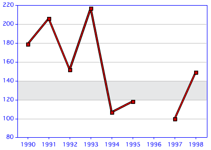
(Note this XML also turns off interpolation and 3d effects which isn't required for what we are doing.) The limits tag is placed with the yAxis tag. I picked my min and max random based on the data I have for my sample and the color is a gray that matches the rest of the chart. This produces a chart like the one below:
Neat trick! I've included a complete script below for folks to play with.
<!--- style from webcharts --->
<cfsavecontent variable="style">
<?xml version="1.0" encoding="UTF-8"?>
<frameChart isInterpolated="false" is3d="false">
<yAxis>
<limits index="0" min="120" max="140" color="#e6e7e8"/>
</yAxis>
</frameChart>
</cfsavecontent>
<p><p>
<cfchart chartWidth="400" chartHeight="400" title="Sales" style="#style#">
<cfchartseries type="line" query="q" itemColumn="year" valueColumn="sales" /> </cfchart> <cfchart chartWidth="400" chartHeight="400" title="Sales">
<cfchartseries type="line" query="q" itemColumn="year" valueColumn="sales" /> </cfchart>
<cfset q = queryNew("dept,year,sales","varchar,integer,integer")>
<!--- generate random sales data --->
<cfloop index="y" from="1990" to="1998">
<cfscript>
queryAddRow(q);
if(y neq 1996) {
querySetCell(q, "dept", "Gamma");
querySetCell(q, "year", y);
querySetCell(q, "sales", randRange(80,220));
} else {
querySetCell(q, "dept", "Gamma");
querySetCell(q, "year", y);
}
</cfscript>
</cfloop>
<cfdump var="#q#">
Archived Comments
This is fantastic. I've been running a Disc Golf site for 2 years now and have always wanted to show Par in relation to actual. *bow to those greater than I*
So when are you going to play a real sport?
*ducks*
Ray's script doesn't work for CFMX7, so with his help, this is a revised sample if you're working on with CFMX7:
<cfset q = queryNew("dept,year,sales","varchar,integer,integer")>
<!--- generate random sales data --->
<cfloop index="y" from="1990" to="1998">
<cfscript>
queryAddRow(q);
if(y neq 1996) {
querySetCell(q, "dept", "Gamma");
querySetCell(q, "year", y);
querySetCell(q, "sales", randRange(80,220));
} else {
querySetCell(q, "dept", "Gamma");
querySetCell(q, "year", y);
}
</cfscript>
</cfloop>
<cfdump var="#q#">
<!--- style from webcharts --->
<cfsavecontent variable="style">
<?xml version="1.0" encoding="UTF-8"?>
<frameChart isInterpolated="false" is3d="false">
<yAxis>
<limits index="0" min="120" max="140" color="#e6e7e8"/>
</yAxis>
</frameChart>
</cfsavecontent>
<p><p>
<cfchart chartWidth="400" chartHeight="400" title="Sales" style="/style.xml">
<cfchartseries type="line" query="q" itemColumn="year" valueColumn="sales" />
</cfchart>
Let me give some context to Hatem's comment (we were talking on IM).
The cfchart tag has a style attribute (obviously), and it allows you to pass in either an XML string, or a path name. Ie, the path to a file. For some reason, CF7 (and I think CF6) always seemed to have issues with the XML as a string option. So for him I simply recommended saving the XML. Others may have to do the same. There is probably a nicer workaround, but I don't have a CF7 box to test with.
Secondly - he had to remove isInterpolated from his version of the XML. That threw an error. I'm guessing that the bundled WebCharts was updated in CF8. Interpolation is a pretty trivial feature though. I bet CF7 supports enabling/disabling it, but it probably uses a different XML value for it. I'd recommend folks playing with the chart editor to see.
Between 50 and 70? Let me bring you golfing some day my friend....if you keep pace with me, you'll be near 70 on the FRONT 9! ;-)
Thanks for the tip
Davo
A reader asked me (off blog) if you can do multiple limits. Absolutely. Just use additional <limits> tags:
<limits index="0" min="120.0" max="100.0" color="#CC99FF"/>
<limits index="1" min="350.0" max="300.0" color="#00C451"/>
Thanks for this posting! It partially solved a big headache for me: for my Y axis, I needed to somehow show numeric values below the "700" Y value to be Good and those above 700 to be Bad. This gives me a visual way to do this.
Originally I had hoped to make the 700 value gridline in red (as opposed to the default gray color) or to make the 700 value label on the Y in red. I couldn't find anyway to do this, although in WebCharts you can set the "show zero level" frame attribute so that the gridline is the same color as the frame, but nothing to allow me to set a different gridline level.
Maybe you know a secret way to accomplish either of these? (hope beyond hope)
You could use a second series where the second series is a line and is _just_ the value 700.
Thanks so much for your reply!
I tried creating a static series, and it "works" to set a red line at the Y axis. However when I did that - some of the attributes I used for the first series was overwritten by the second series.
The first series (a bar chart) had a colorlist attribute so that the max and min values were different than the default color. Also, I set the dataLabelStyle="value" in this first series.
Once I introduced the second series, the bar chart values for the first were all changed to the same color (no longer was showing max/min colors). Also, the dataLabel in the second series, which was set to none, now displayed like the first (with values showing).
Does that make sense, without seeing code?
It kinda makes sense. You may need to switch to using XML to style _everything_.
Can I do like that in cfmx 6.1?
If I remember right, in CF 6, you could only use a file for the style attribute. So you could try saving that xml to a file and then point to it with the style attribute.
Thanks so much for your reply. I think,
style attribute is does not have in CFMX 6.1 because i use style attribute in cfchart error occur like that "Attribute validation error for tag chart. The tag does not have an attribute called style, etc.."
I'm sorry - I checked the reference again and style was added in 7, not 6.1.
I'll point out though that there are many other charting engines out there - some free. You should be able to use many of them.
Thank a lot for your advise.
Raymond, do you know if we can change the tip text ,
to let the tip text takes its information from a query ,
i need it for the purpose of doing this (my chart is line of percentages, and for example ,the percentage in one point is (25%) i wanna show in the tip for that point (50/200)), thank you so much.
I dug around a bit in the chart designer, and while I could modify some of the design properties of the popup, nothing else seemed to work.
Hi, I am having a problem with multiple series chart where the 0 value will be displayed on the graph as a straight line. i want display only data that doesn't have a 0 value.
i have also check those two links wher they said this is a bug in some build of CF9 but i have the lastest build of CF 9.
http://forums.adobe.com/mes...
https://bugbase.adobe.com/i...
i check the interpolated in the xml file on inside cf9 directory and it seems to be false.
i really appreciate any help
I think you want this. http://www.raymondcamden.co...
Thanks for the reply Raymond but i tried it. both external and internal xml but still the same
Ok I just checked your forum link. This _is_ a bug. So... I'm not sure what to tell you. There are _numerous_ other charting engines out there, many JavaScript based, that would probably work just fine.
Hello Raymond,
Is there a way to move limits in front of the bars?
Not sure. Best I can recommend is playing with the chart editor as I did. I don't use cfchart anymore, nor do I recommend it.
Thank you for your answer Raymond.
Unfortunately I need it in order to include charts as part of pdf generation project and so far it have been a convenient way to do so. The other problem is that I can't find the chart editor application on our CF10 server installed on MacOS. There is only a pdf documentation included. I found that I can use the multicharts to combine bars and line and this is the next thing I will try.
On my Mac, it is /Applications/ColdFusion10/cfusion/charting/webcharts.sh.