Over the weekend I decided to write up a quick example of form validation in jQuery Mobile. Obviously there are many ways you can accomplish this and I just wanted to take my own little spin with it. Here's what I came up with and I'd love to hear how other jQuery Mobile users are doing validation.
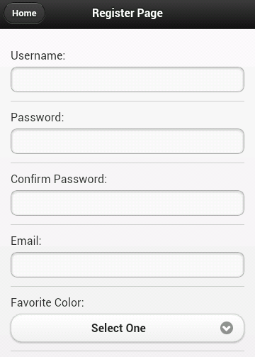
Let's start off with a real simple jQM site. It will have a home page with links to two sub pages. My form will be on the second page. To be honest, I could have just built a one page site, but I wanted something with a trivial bit of navigation to it so it felt just a bit more realistic. I won't bore you with all the code (you can view source on the demo yourself), but here is our simple form:
The form consists of 6 fields: username, password, the password confirmation, your favorite color, and your home town. The validation rules should be:
- Everything but the home town is required.
- Username, password, and the confirmation must be 5 characters minimum.
- The password confirmation must match the password.
Pretty simple, right? Without any validation at all, you can take this for a spin here:
And if you don't want to bother with that - a quick screen shot (which I generated from Adobe Shadow thank you very much):
Ok, so let's talk validation. It would certainly be cool if we could just use HTML5 form validation, right? I mean, look at the mobile browser support for Canvas:
That's a hell of a lot of green. So obviously - if there is that much support for canvas, which is only mildly useful in practical matters - surely there is even higher support for form validation, something we probably all use every single day.
sigh
Ok, so moving on from that, let's talk options. Obviously we can roll our own JavaScript. It isn't terribly difficult to do so. But I thought it might be nice try the jQuery Validation plugin. I've blogged on it before (see links at the bottom) and I liked how simple it made things. I thought I'd give it a shot here and see how it ran.
The plugin provides two main ways of adding validation to a form. You can either add items to a class attribute of your form or supply a list of validation rules when initializing the plugin. Personally, I don't know which I prefer. I wish the plugin made use of a data-attribute instead of a class, but I like seeing my rules in the HTML. I went with that approach but just keep in mind you have the other option as well.
Here's the updated HTML for the register page (just the form bits):
Notice the addition of class="required" to my fields requiring validation. Also note the minlength of the first three fields. This is - pretty much - all it takes. The one big obvious piece missing is the "confirmation must match password" field but that can be handled in a custom rule. I also had to initialize the validation but that's one line of code: $("#registerForm").validate();
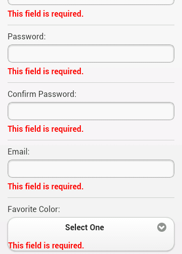
So far so good, right? But check out the result:
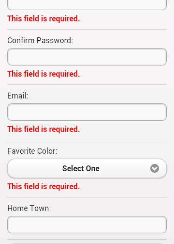
First, the errors don't really stand out and second - note the error for the drop down. It's actually inside the custom jQM drop down field. Not good. Let's tackle the design first. By default, the validation plugin will use an error class for displaying errors. That means it is pretty trivial to make it look a bit nicer:
Which results in:
Nice. About halfway there. You can demo this version here: Round 2
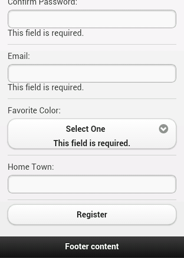
So what about the weird drop down behavior? We can use another feature of the plugin to handle that. You can use a property, errorPlacement, that allows you to dynamically determine where errors should be written out. While we're at it, we can also go ahead and create the custom rule for password matching.
To be honest, the use of .parent() there was a bit of a guess, but it worked on first try. In case you're curious, to add the custom validation to the second password field I just had to add the name to the class list: class="required passmatch".
You can demo this version here: Round 3
So, what do you think? I'd like to work on this a bit more. On the iPad, the errors are left aligned under the labels, which is kinda cool, but I could also see them being aligned with the fields instead. On desktop it is way off but I kinda figure that is an edge case and not something I'd have to worry about. As always, comments and critiques are welcome.
Archived Comments
Ah...jQuery validate(). I love you so. Although I always get tripped up at the same point: errorPlacement styles. My solution was for a tightly styled form that couldn't expand vertically:
[code]
errorPlacement: function(error, element) {
// I wanted my errors to prepend the label with a simple *required*
error.prependTo(element.parent());
// this was for a checkbox field that sits all on one line, didn't have a label to append to.
if (error.attr('htmlfor') == 'interest') {
$(element.parent()).addClass('highlightError');
}
},
// because I was doing my own custom highlight function, I had to add my own "unhighlight"
unhighlight: function(element, errorClass) {
$(element).removeClass(errorClass);
if ($(element).attr('name') == 'interest') {
$($("#interest").parent()).removeClass('highlightError');
}
},
[/code]
Like it Ray. I'm doing some jQM sites now and I've just been rolling my own and using a dialog to pop up what the errors in the form are.
@Kevin: In theory, you could use the plugin to handle the 'check' work and then just write a custom function for the popup. I mean if you were interested in using the plugin for it's validation logic and having REALLY custom UI.
Good One ray, Btw i prefer Validation to be done on server side and show with timeout to come & go :)
Every time I talk about client side validation I try like hell to ensure I remind folks that they must ALWAYS do server side validation as well. It is CRITICAL. And I forgot this time. Thanks Misty!
Ray, since you are looking at Form Validation in JQM (jquerymobile), can you answer the following question:
- Why won't Spry Validation work with JQM?
- See this post: http://forums.adobe.com/mes...
- Can you work up an example of JQM & Spry that works when using a Form Submit?
I find it curious that Dreamweaver includes both JQM & Spry but I have yet to see an example or post anywhere.
Thanks..
ps: thanks for the simple captcha.
As far as I know, Spry is no longer being worked on and I do not recommend people use it. I loved it back in the day, but as a framework, it isn't viable anymore and shouldn't be used. To be clear, this is my opinion and not the company's opinion, but I think even "officially" we can say that Spry is no longer in active development.
Sounds good.. regarding that post about Spry, since I could not get it to work back then, I went ahead and used the jquery validation plugin.
One question:
- Here is my form: http://cerberus.clearwave.c...
- Since I'm using JQM collapsible panels, how do I get validation to pop-up a nice box saying "The following fields are required" and then have it take to me to the first required field? as it is now, if the panel is collapsed, you have to go find the required fields..?
"how do I get validation to pop-up a nice box saying "The following fields are required"
check out jQM's new popups.
"and then have it take to me to the first required field? as it is now, if the panel is collapsed, you have to go find the required fields.."
This would be more complex. If you know which is your first 'bad' field, you could use jQuery to get the parent() which should be the collapsible div and check it's status. I can't remember offhand the exact API, but check the docs. There is a way to see if a div is collapsed or not.
Thank you so much for this tutorial.
There seems to be a new feature in validator called equalTo
An alternative to check for same password being typed,
In HTML
<input type="password" name="password2" id="password2" equalTo="password" >
In Javascript (if we want to override default error message)
$("#registerForm").validate({
messages: {
password2: {
equalTo: "Confirmation password must match."
}
....
I don't believe you are right. I tested this in Firefox and Firefox and it didn't work I also checked the HTML5 Spec and it isn't listed there.
Oh, this is not HTML5 tag, it is part of the validation plugin, please see here.
http://docs.jquery.com/Plug...
I am just using the inline way of "calling" equalTo, that's all
It works, I am using it in my code.
Ah, sorry, I thought I had focused on *just* html5 validation in this post, but I did not - I used a plugin. Sorry! :)
Hi Raymond!
Thank you for the article...
I'm moving some tiny steps into jQuery Mobile but validation is truely driving me crazy.
I've tried 200.000 tutorials and methods but the main problem is that if I get in the form page with a link that uses data-ajax=false everything works.
If I do it in ajax the form is sent without any kind of validation.
Probably I didn't understand much about where to put the script that should handle validation?
Right now I put in <head> and I've tried this:
<script type="text/javascript">
$(document).bind('pageinit', function () {
$(insert).validate({ // or form #id
rules: {
field: "nick" // field name not #id and has class="required
},
submitHandler: function (form) {
alert('data submitted');
return false;
}
});
});
</script>
But it's not working :(
Can you please help? It is becoming my nightmare.
Well, I'd begin by ensuring your pageinit code is actually running. If you add console.log('pageinit fired'), do you see it in the console?
Thank you for your answer, Raymond!
I've tried every kind of tutorial in the internet and I got to this final resolution:
if I use a link to get to the form's page the link has to have or ajax-data=false or rel="external" (but this way I'd lose the cool transitions) otherwise the form validation will not work (but it'll work on reload).
Your suggestion cleverly got to the point: my pageinit is fired _only_ if I modify the incoming link to disable ajax.
I want to pull all my hairs!
Err, not exactly. pageinit will fire when a JQM page is set up initially. I'd argue that while you have your stuff working now, it is incorrect still. If you want to return to your original code and share it (via Gists) I'd like to help.
God bless you! :D
Here's my "vanilla" pages:
https://gist.github.com/ano...
Where is the JS? Keep in mind that JQM, by default, creates a "SIngle Page Architecture" type app. So when you go from your first page to your second, unless you override it (as you did), JQM fetches the second page and injects it in the DOM.
Therefore, if you want to have code that runs on a page being created, your current code may need to get more specific.
For example: $(document).bind('pageinit', function () {
Says to listen to ALL pageinit calls. You probably want the one for your specific page. Imagine that page has a <div data-role="page" id="second">. You could do this instead:
$(document).on('pageinit', '#second', function () {
Oh, sorry!
The js comes from standard google liks for jquery and jquery mobile (of course jquery is before jquery mobile in the head section).
So, excuse me again, if I have simple code like this:
(insert is my form's id)
$('#insert').submit(function() {
alert('Hey, you pressed the button!');
return false;
});
What should I change?
It's related to a very specific form and, again, it works if I reload the page.
Probably I simply have bad basic understanding of how jquery works but official documentation seems to be not sufficient for me...
I think it's time to buy a book :)
Well, first, you can use that, but it isn't the same as the jQuery validation plugin. Did you try the code I suggested? It goes into your own JS file that should be included in the <head> of your main HTML file.
It works! :D
I've simply switched to multi-page and now it works gracefully!
Here's info for anybody who suffered like me:
http://jquerymobile.com/dem...
:)
Thanks for you help and your precious blog, Raymod :)
You are welcome.
Hi there, it's me again...
I'm trying to solve a small but annoying issue on jquery form: my form gets submitted every time an user press "go" on android keyboard or enter on the pc.
How can this be solved in the correct way?
Thanks a lot and excuse me for bothering.
Is this online where I can see?
Silly me!
Here's the way I've found (correctly working for my tests):
function DisabilitaSubmit()
{
$('input,select').keypress(function(event) { return event.keyCode != 13; });
}
You think this is a good method or a bad one?
Thanks :)
Seems fine to me.
Hi Raymond- sorry to post to an old thread, but thought I'd ask since this is related.
With the new markup format of text inputs in <a href="http://view.jquerymobile.co...">jQM 1.3.1</a>, it seems error placement in jQuery Validation gets thrown off- jQM 1.3.1 adds a div wrapper around the input, so that div is now what I need to style rather than the input, and the .valid class applied to the input as well needs to be on that parent div. I know I can control this via errorPlacement, but it seems like there should be a quicker solution to this - before I update all my errorPlacement calls. Any ideas?
Um... no, outside of the errorPlacement idea.
No problem, thanks for looking. Here's my initial solution, which shows the css and js to change for the new markup format.
http://jsfiddle.net/ericbur...
Very nice and easy to follow.
Thanks!!
HI Ray,
I'm working on my first jQuery Mobile site with form validation and found this great post. My target audience is iPad users only - as you noted in your post the positioning of the errors appears on the left of the labels for input fields, not under the fields themselves.
Is there a way to change this so they appear under the fields, just like on an iPhone?
thanks,
Steve
Steve - all I can suggest is messing w/ errorPlacement.
Hi Raymond,
i hope you can solve my problem, i have a form that uses your example... but everytime I try the validation, it doesn`t work... I have to regresh the page and then it works perfectly, but only if I refresh...
Blessings.
Mario.
i forgot.. i use this to call the validation:
$(document).ready(function() {
$("#form").validate();
});
Regards.
Mario
You can't use it in document.ready as the form may not be loaded then in jQM. Look at my examples - I use the pageshow event instead.
Alright! Raymond... also i want to share one point... maybe most of people knows it, but I forgot than Jquery mobile at the time of changuing pages, it just load the <BODY> of the next page...
also change the script to pageshow solve the problem.
Thank you so much Raymond!!
To be anal, jQM is loading the <div data-role="page"> aspect of the page, not just everything inside <body>.
oh.. well.. good to know master hehe
thank you for all the help.
you really save my ass.
Mario.
Just for the record, in the errorReplacement function, instead of using:
if (element.attr("name") === "favcolor") {
it's nicer and more portable this way:
if ($(element).is("select")) {
don't u think?
Cheers
Joan
Agreed!
very nice
Thanks for this useful example, Raymond. It's really helpful!
I've got all the files (index.html, register.html, some.html, main.js and app.css) in the same directory (as you do in demos/2012/jul/30/round3) but for some reason I get 'Error Loading Page' when submitting the form and the validation doesn't happen.
I've downloaded the jQuery Validation plugin (jquery-validation-1.11.1.zip), unzipped it and copied it into the same directory, but it still doesn't work.
Please I'd appreciate if you could help me solve this little issue. Thanks!
FYI, Daniel and I worked it out in email.
:) I know, Raymond. Thanks for that!
Thanks , im quite surprised JQM haven't implemented a basic validation into the core files as most people only require the basic submit / validation functions.
nice article, did'nt knew the abc of jquery validation but after reading this article, i have use it in my project. thanks author.
Hi Raymond. Excellent article!
I have the same problem with Daniel, for some reason I do not know I get 'Error Loading Page' when submitting the form and the validation doesn't happen.
I am using google chrome for testing.
I would be grateful if you could help me solve this little issue. Thanks!
If you can share the URL with me, I can take a look.
Thanks for the reply.
Actually I am trying to test your sample. When I submit the form without any input, validation is not triggering. It is trying to load form action. As I said I am testing the html page in chrome on desktop computer.
I uploaded the html page to this location:
http://www.fileconvoy.com/d...
Thanks in advance
If you run my code as is, it is trying to post to a ColdFusion script. If you don't have that installed, it will not work. You mentioned "chome on desktop computer" - you should also have a local web server installed too. You can then change the action value to something.html. Your form data won't be shown on the other page, but you can test the JS code at least.
If I just set
<form action="#" method="post" id="registerForm">
should this not show validation errors in the page?
I was expecting the js code work before form action but it still does not...
These all may be naive questions since I am still html , js newbie....
It should work, yes, but if you can't put it on a web server that I can see, I can't help more. You can try using your browser devtools. It may show a better error message.
This is a really cool jump start on the validation plugin. I got it up and running in just a few minutes.
Is there a clean way to tell when there has been a validation problem so that I can stop the submit of the form (not really a submit but the processing of the click event behind a button)?
Hmm - are you saying the form post is still going through even when an error occurs? It should be stopping automatically.
Hi, can you post similar workout for date and time field for jquery mobile with jquery validation.
Validation error doenst show up for date fields as they are hidden and wrapped by another display div over.
As the field is hidden, so the validation plugin doesnt work.
Any help would be great.
Sorry - haven't worked on this one in quite a few years.